Sprek Norge Institutional
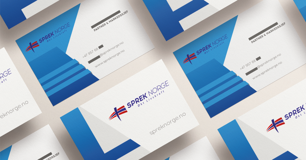
The Norwegian sports events company Sprek Norge contacted us to create their brand and visual identity, as well as other materials such as corporate presentations, fleet positivation, merchandising and commercial materials.
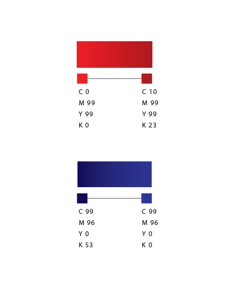
As the name itself brings the Norwegian tradition (Norge meaning “Norway” in the local language), we adopted the color palette of the flag and sought inspiration in the sails of Viking ships to build the icon that represents it. All the work was translated into Norwegian, in addition to Spanish and English, further internationalizing its presence.


 back
back